Introducing Checkout 3.0: More intuitive, less friction
We’ve upgraded our hosted checkout, and are offering merchants a new way to implement our checkout into their app flow with our new mobile software development kit (SDK).
The result: Volt Checkout 3.0, designed to increase conversion through powerful, scalable UI.
Core elements of our Checkout 3.0
Optimised onboarding and built-in ‘Remember me’ functionality
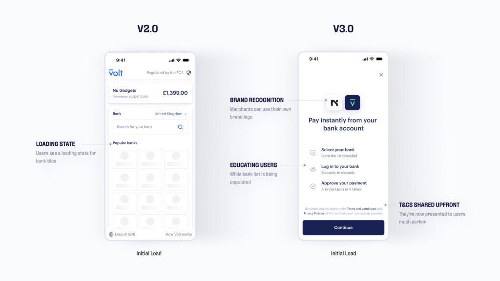
We’ve added an educational ‘Welcome’ screen for all new visitors, explaining – in just a few steps – how easy it is to Pay by Bank with Volt.
Previously we gave the user an option to learn more about how to use Volt through a smaller link within our checkout. However, from research, it was clear users were more comfortable when they knew exactly what was coming next. A global study by market research and analytics firm, YouGov, found that convenience and speed are the top factors motivating consumers to use digital payment methods at checkout – both of which are communicated through our UX.
This is only shown the first time a user chooses us to form a sense of trust – especially if it’s a new option for them. Two-fold, we utilise this screen to dynamically pre-load our banking list, ready for consumers to select straight after, rather than version 2.0’s loading state screen.

Meanwhile our new front-loaded T&Cs on the onboarding screen allow us to capture users’ permission to save their bank details early on. This means merchants can offer returning users a faster checkout experience; we auto-populate their previously chosen bank upon return, creating a ‘one-click’ checkout with minimum input required.
Bank app logos based on customer recognition
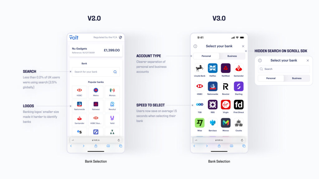
To be clearer and more reflective of users’ mobile interactions, the logos shown in Checkout 3.0 are those of banking apps as opposed to the banks’ official logos in version 2.0. The same approach went for distinguishing Personal and Business; both are clearly separated in our checkout, making it easier and faster for users to identify their bank.

Detailed transaction summary
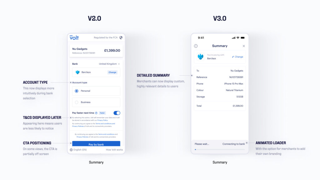
Version 2.0 of our checkout has our terms and conditions, plus the ‘Remember me’ toggle to save users’ bank details, shown on the same screen as the total amount. In Checkout 3.0, our T&Cs are presented earlier in the journey, giving merchants using our hosted checkout the opportunity to add more details to the transaction summary.

For example, a customer buying the latest iPhone online wants to be sure they have selected the right item at checkout before committing to the purchase. The brand can show the total amount and details such item type, storage limit, and colour to add an extra layer of reassurance.
An embedded app-to-app flow
Our new mobile SDK, built for iOS and Android, enables our merchants – with a skilled developer on their side – to embed our checkout into their own app. With this component-based approach, merchants are in control by building a custom experience best suited to their application and target audience.
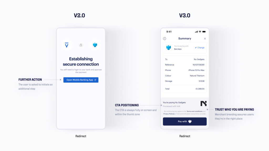
They also gain the ability to personalise their checkout with their name and logo, which will be followed by being able to add elements such as brand colours in the coming months.

It keeps users within the same flow for the whole process, creating a more native experience and further solidifying their trust in Volt. The user simply needs to choose their bank to be automatically redirected to their app, approve the payment through the likes of biometrics, then the transaction is complete.
Existing Volt merchants can choose to upgrade to our new checkout first in the UK, with EU markets coming soon. Interested? Find out how you can take your checkout to the next level with Volt today.
